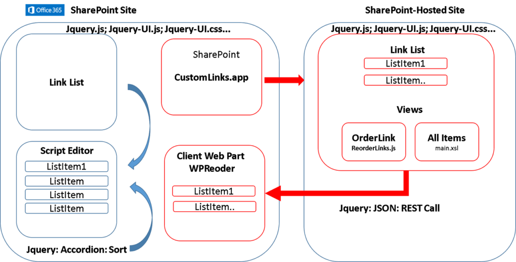
The accordion web part in SharePoint allows you to collapse and expand sections of content, like an accordion in music.
This saves space on the page. The out-of-the-box accordion works well, but you may want to customize its appearance to match your company brand.
In this guide, we’ll cover how to tweak the accordion web part SharePoint colors, text, icons, and more.
Why Brand Your SharePoint Accordions?
Matching your SharePoint pages to your overall brand creates a cohesive and professional look.
It also helps users instantly recognize they are still within your digital environment when navigating your intranet or team sites.
Key reasons to brand accordions:
- Consistent brand experience across SharePoint
- Professional, polished look for intranet
- Increased user confidence they are in right place
- Stronger brand association with your organization
Now let’s examine exactly how to brand your SharePoint accordions.
Accessing Accordion Web Part Properties
To customize an accordion web part, you first need to access its properties panel:
- Edit the SharePoint page containing the accordion web part
- Hover over the accordion then click the ellipsis (…) to open the menu
- Select Edit Web Part
This opens the properties panel on the right. Here you can tweak various settings.
Core Branding Options
These properties directly relate to matching your overall brand:
| Property | Description |
| Theme Style | Matches font styling to your theme |
| Border color | Changes border color around accordion |
| Chevron icon | Replaces default expand/collapse icon |
Let’s look at each key property for branding accordions:
Applying Theme Style
Applying your SharePoint theme style is the fastest way to brand accordions. It automatically matches key elements like font sizes, colors and more to your selected theme:
- In the accordion properties, find the Theme Style dropdown
- Select your desired theme
- The accordion text will shift to match your theme fonts and adjusted for readability
💡 Pro Tip: Want font colors to match? Set theme font colors under Site Settings > Change the look.
Changing Border Color
The out-of-the-box accordion has a gray border. Changing this to your brand color helps visually tie it together.
To change border color:
- Go to the Border Color setting
- Select desired color from the dropdown palette
- Click Apply to see border color change
See the exact hex code for your brand color? Enter it into the box below the palette.

Swapping the Chevron Icon
The small chevron icons used to indicate an expandable section can also be replaced:
- Go to the Chevron Icon setting
- Click the dropdown and Upload new icon (svg, png under 1MB)
- Crop the icon boundaries if needed
- Hit Apply to see new icon
💡 Pro Tip: For best results, use a solid-color icon sized around 20×20 pixels.
Additional Customizations
Beyond the core branding properties covered above, you can tweak further accordion parts:
- Panel backgrounds
- Text font sizes
- Padding around text
- Shadow effects
- Animation speeds
- Initial collapsed state
Found under the miscellaneous accordion settings.
Now you know how to tailor the out-of-the-box SharePoint accordion to match your brand.
Start with the key properties covered here like theme, border color and icons. Then explore additional tweaks to polish your branded accordion even further.
Learn step-by-step how to customize the default SharePoint accordion web part’s colors, fonts, icons, and more to align with your organizations brand standards.


